Table of Contents Link to heading
- Introduction
- Logistic regression overview
- Exploratory data analysis and feature engineering
- Model fitting and performance metrics
- Feature selection
- Feature importance
I recently stumbled upon a nice Superstore Marketing Campaign Dataset during my weekly (as one does :) ) browsing sessions through Kaggle. The Kaggle data card has great motivation build around the dataset that I am pasting here:
Context: A superstore is planning for the year-end sale. They want to launch a new offer - gold membership, that gives a 20% discount on all purchases, for only 499 USD which is 999 USD on other days. It will be valid only for existing customers and the campaign through phone calls is currently being planned for them. The management feels that the best way to reduce the cost of the campaign is to make a predictive model which will classify customers who might purchase the offer.
Objective: Build a predictive model of the customers giving a positive response. Identify the different factors/features that which affect the customer’s response and their importance.
Dataset: Data from last year’s campaign that contain information on 2240 Superstore’s customers (20 features + id + label).
I think that this is an awesome case study to show a complete logistic regression pipeline in Python. In particular, this post will go over the following:
- Overview of logistic regression
- Exploratory data analysis and feature engineering
- Model performance metrics (precision, recall, ROC curves, etc.)
- Feature selection via Recursive Feature Elimination and cross-validation
- Model interpretation and feature importance
Logistic regression overview Link to heading
Logistic regression model is a popular supervised learning algorithm for binary classification due to its interpretability, solid predictive performance, and intuitive connection to the standard linear regression. The logistic regression model assumes that a binary response (target, label, will use interchangeably) $y_i$ follows a Bernoulli distribution with probability of success $p_i$:
$$y_i \mid p_i \sim \textrm{Bernoulli}(p_i).$$
To relate a feature (predictor) vector $x_i = (x_{1,i}, \dots, x_{p,i})^T$ to the response $y_i$, logistic regression typically considers the natural logarithm of odds $p_i / (1 - p_i)$ (also known as logit) to be a linear function of the predictor variable $x_i$:
$$\textrm{logit}(p_i) = \textrm{ln} \bigg(\frac{p_i}{1-p_i}\bigg) = \alpha + \beta^T x_i,$$
with $\alpha$ and $\beta$ being regression coefficients. Note that it is a bit more challenging to interpret the coefficients in the logistic regression than in standard linear regression as $\alpha$ and $\beta$ are directly related to the log odds $p_i / (1 - p_i)$, instead of $p_i$. For example, $e^{\alpha}$ is the odds when the value of predictor $x_i$ is 0, whereas the quantity $e^{\beta}$ refers to the change in odds per unit increase in $x_i$.
Lastly, by rearranging the terms in the logit equation, one can express the probability of success $p_i$ as
$$p_i = \frac{e^{\alpha + \beta^T x_i}}{1 + e^{\alpha + \beta^T x_i}}.$$
The target prediction is done by thresholding on $p_i$. That is $y_i = 1$ if $p_i > t$ and $0$ otherwise where $t$ is a fixed threshold between $0$ and $1$. Typically, $t = 0.5$ so that $y_i = 1$ if $p_i > 1-p_i$.
Exploratory data analysis and feature engineering Link to heading
Let us start by getting a better sense of what dataset we are working with, dealing with (potentially) missing values, and finding out which features might be related to the label. To do so, we will use of pandas, the go-to package for manipulating rectangular data, numpy, and some data visualization tools in seaborn and matplotlib.pyplot.
import pandas as pd
import numpy as np
import seaborn as sns
import matplotlib.pyplot as plt

store_data = pd.read_csv("superstore_data.csv")
store_data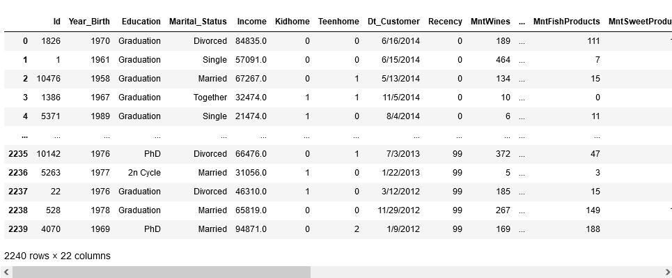
store_data.info()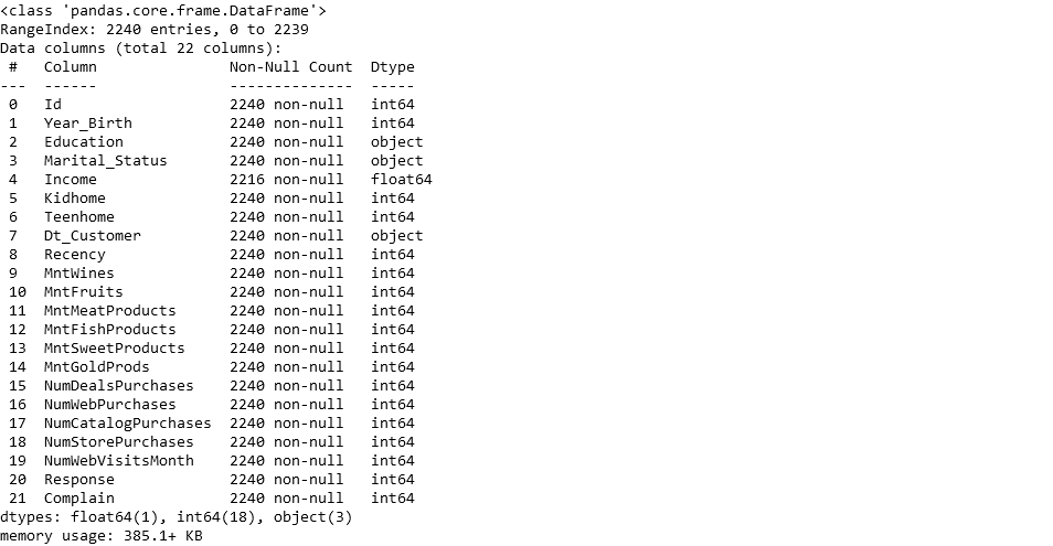
As we can see, the dataset is a mix of quantitative and categorical features which will have to be transformed into dummy variables. Before we get to that, it looks like a few customers have missing information about income. Since proportion of records with missing values is really small compared to the size of the dataset, we can just get rid of the records with missing values.
store_data = store_data.dropna()One last step before moving onto some EDA and creating dummy variables is to deal with the Dt_Customer feature that corresponds to the date of a customer’s enrollment with the company. One way to use this information is to create a new feature Days_Customer that says how many days has a customer been enrolled with the company.
from datetime import datetime

def days_since(date1: str, date2: str, day_format: str) -> int:
    """ Date1 - Date2 in days

    Parameters
    ----------
    date1 : str
        First date
    date2 : str
        Second date
    day_format : str
        Strong defining the date format

    Returns
    -------
    int
        Number of days between date1 and date2
    """

    d1 = datetime.strptime(date1, day_format)
    d2 = datetime.strptime(date2, day_format)
    diff = d1 - d2
    return diff.days

day_transform = []
for index, row in store_data.iterrows():
    day_transform.append(days_since("1/1/2023", row["Dt_Customer"], "%m/%d/%Y" ))
store_data["Days_Customer"] = np.array(day_transform[:])
In general, the goal of EDA part of logistic regression modeling is to get a sense of what features are important predictors of the label as well as discovering some potential limitation of the dataset. First, we can see that the dataset is not balanced with respect to the number of customers that responded positively to the last year’s campaign:
sns.catplot(data = store_data, x = "Response", kind = "count")
plt.show()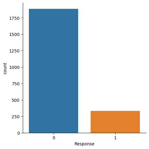
This imbalance can lead to a high variability of model performance metrics as the proportion of customers with a positive response will be relatively low in the testing dataset. Moving on to exploring the categorical features Education, Marital_Status, Complain, Kidhome, and Teenhome, starting with the Education, we can display a side-by side barplot:
sns.countplot(data=store_data, x="Education", hue="Response")
plt.show()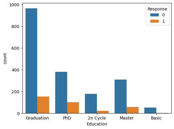
What is the problem here? Since the number of customers differs among the Education groups, it is hard to see which group had a better response to the campaign. This can be simply addressed by looking at the proportions of positive responses within each group:
education_feature = store_data.groupby("Education")["Response"].sum() / store_data.groupby("Education")["Response"].count()
education_feature.plot(kind="bar")
plt.show()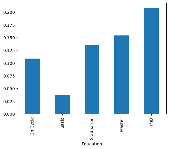
We can clearly see that the biggest yield was for customers with PhDs and the smallest for customers with “basic” education. We can similarly explore all the other categorical features. It appears that all them will be helpful in predicting which customer will respond positively to the campaign, perhaps with the exception of Complain.
ms_feature = store_data.groupby("Marital_Status")["Response"].sum() / store_data.groupby("Marital_Status")["Response"].count()
ms_feature.plot(kind="bar")
plt.show()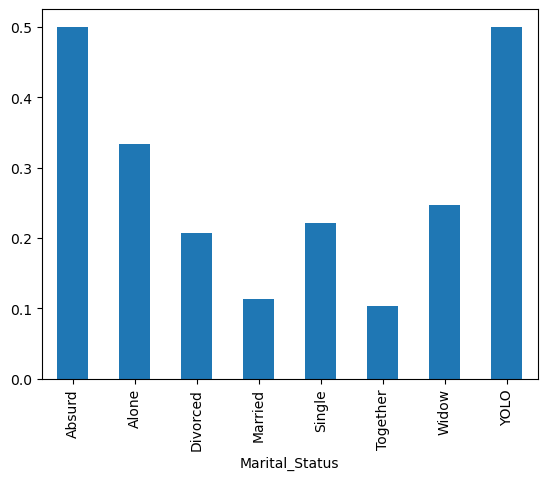
complain_feature = store_data.groupby("Complain")["Response"].sum() / store_data.groupby("Complain")["Response"].count()
complain_feature.plot(kind="bar")
plt.show()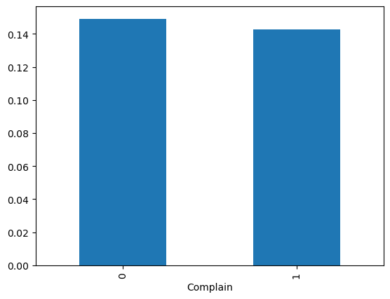
kid_feature = store_data.groupby("Kidhome")["Response"].sum() / store_data.groupby("Kidhome")["Response"].count()
kid_feature.plot(kind="bar")
plt.show()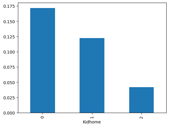
teen_feature = store_data.groupby("Teenhome")["Response"].sum() / store_data.groupby("Teenhome")["Response"].count()
teen_feature.plot(kind="bar")
plt.show()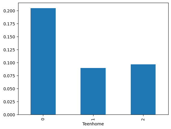
To see the relationships between quantitative features and label, we can compare the distributions of a given quantitative feature for customers with positive and negative responses. This can be done using side-by-side boxplot or more clearly, using the sns.pointplot() that displays the means of each group together with their confidence intervals:
quantitative_features = np.logical_not(np.isin(store_data.columns.values, ["Id", "Teenhome", "Kidhome", "Education", "Complain", "Marital_Status", "Dt_Customer", "Response"]))

fig, axes = plt.subplots(4, 4, figsize=(20, 15))
plot_counter = 0

for column in store_data.columns[quantitative_features]:
    sns.pointplot(ax=axes[plot_counter // 4, plot_counter % 4], data=store_data, x="Response", y=column, kind="point")
    plot_counter += 1
plt.show()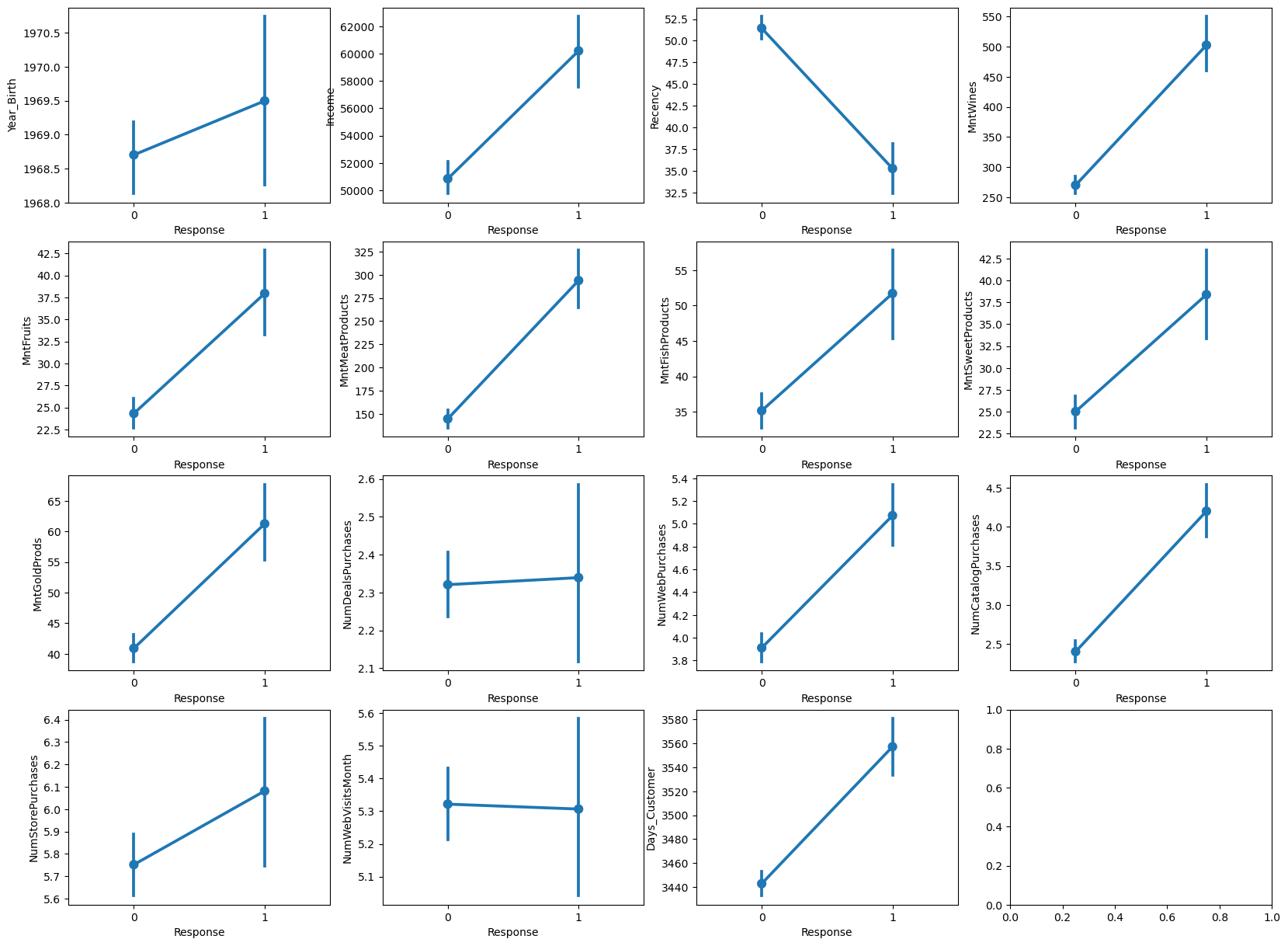
In order to fit the logistic regression model for the superstore customers, we need to transform the categorical features into (indicator) dummy variables and split the dataset into a training and testing dataset.
store_data_dummies = pd.DataFrame()
cat_features = ["Teenhome", "Kidhome", "Education", "Complain", "Marital_Status"]
for feature in cat_features:
    data_var =  pd.get_dummies(store_data[feature], prefix=feature)
    store_data_dummies[data_var.columns] = data_var

data_final = pd.concat([store_data["Response"], store_data[store_data.columns[quantitative_features]], store_data_dummies], axis = 1)

from sklearn.model_selection import train_test_split
X_train, X_test, y_train, y_test = train_test_split(data_final.iloc[:,data_final.columns != "Response"],
                                                    data_final["Response"], test_size=0.33, random_state=123)
One last thing (I promise), it is a good idea to standardize the quantitative features before model fitting. To see why, we should discuss how to assess feature importance. For simplicity, consider a logistic regression model with a single (quantitative) feature. If we increase the feature by 1, the change in odds $p_i / (1-p_i)$ will be proportional to the magnitude of the coefficient $\beta$. This means that a way to assess feature importance is to compare the size of $\beta$ coefficients. However, if the features have different scales or units, the model may give higher coefficients (thus higher importance) to the features with larger values, even if they are not necessarily more important.
from sklearn.preprocessing import StandardScaler

scaler = StandardScaler()
X_train.loc[:, store_data.columns[quantitative_features]] = scaler.fit_transform(X_train.loc[:, store_data.columns[quantitative_features]].values)
X_test.loc[:, store_data.columns[quantitative_features]] = scaler.transform(X_test.loc[:, store_data.columns[quantitative_features]].values)
Model fitting and performance metrics Link to heading
There are many Python packages that implement logistic regression, we will use one of the most popular packages sklearn for ML modeling which also (conveniently) implements metrics that will be used to assess the quality of our model.
from sklearn.linear_model import LogisticRegression

logreg = LogisticRegression(solver = 'liblinear', random_state = 0, max_iter=1000, penalty = 'l2')
logreg.fit(X_train, y_train)
I suggest to go over the LogisticRegression documentation to understand each of the inputs above (we are using L2 regularization to protect against overfitting). The simplest metric to assess quality of the logreg model is accuracy of predictions in hold-out data. That is, how good is the model in predicting whether a customer responds positively or negatively to the campaign.
y_pred = logreg.predict(X_test)
print('Accuracy of logistic regression classifier on test set: {:.2f}'.format(logreg.score(X_test, y_test)))
Our model correctly predicted the behavior of 86% of customers in the testing dataset. The problem of assessing model performance solely based on accuracy is that we ignore how model does within each class. For that reason, it is helpful to consider the following:
- True positives: Correctly predicted positives (ones).
- True negatives: Correctly predicted negatives (zeros).
- False negatives: Incorrectly predicted negatives.
- False positives: Incorrectly predicted positives.
- Sensitivity (also known as true positive rate or recall): Ratio of the number of true positives to the number of actual positives. It says what proportion of actual positives was identified correctly.
- Specificity (also known as true negative rate): Ratio of the number of true negatives to the number of actual negatives. It says what proportion of actual negatives was identified correctly.
- Precision (also known as positive predictive rate): Ratio of the number of true positives to the number of positive predictions (TP / (TP + FP)). It says what proportion of positive identifications was actually correct.
- Fall-out (also known as false positive rate): Ratio of the number of false positives to the number of actual negatives (1 - Specificity). It says what is the proportion of negatives that were incorrectly classified as positives.
You can read about these and (many) other useful metrics here. You can compute all of these from a confusion matrix that gives information about TN ($C_{0,0}$), FN ($C_{1,0}$), FP ($C_{0,1}$), and TP (($C_{1,1}$)):
from sklearn.metrics import confusion_matrix

confusion_matrix = confusion_matrix(y_test, y_pred)
print(confusion_matrix)
If you do the math, we get:
| Recall | Specificity | Precision | Fall-out |
|---|---|---|---|
| 0.41 | 0.95 | 0.58 | 0.05 |
The shortcoming of all the quantities that we just computed is that they depend on the classification threshold. Popular metrics used for classification are the Receiver Operating Characteristics (ROC) curve and the area under the ROC curve (AUC). The ROC curve is a plot of true positive rate (recall) vs false positive rate (fall-out) that shows the performance of classifier at various classification thresholds. Lowering the classification threshold classifies more items as positive, thus increasing both false positives and true positives. The AUC measures the entire two-dimensional area underneath the entire ROC curve. AUC provides an aggregate measure of performance across all possible classification thresholds. AUC ranges in value from 0 to 1. A model whose predictions are 100% wrong has an AUC of 0.0; one whose predictions are 100% correct has an AUC of 1.0. A model that assigns a class label randomly will have AUC of 0.5. Therefore, the higher the AUC, the better the classifier irrespective of the classification threshold. Fortunately, sklearn has a pre-build functions that make printing the ROC curves and computing AUC simple.
from sklearn.metrics import roc_auc_score
from sklearn.metrics import roc_curve

logit_roc_auc = roc_auc_score(y_test, logreg.predict(X_test))
fpr, tpr, thresholds = roc_curve(y_test, logreg.predict_proba(X_test)[:,1])
plt.figure()
plt.plot(fpr, tpr, label='Logistic Regression (area = %0.2f)' % logit_roc_auc)
plt.legend(loc="lower right")
plt.xlabel('FPR')
plt.ylabel('TPR')
plt.show()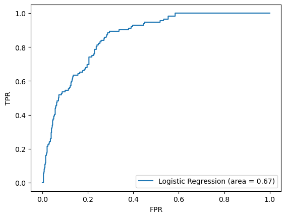
Feature selection Link to heading
It is not always a good idea to keep all the features in the model. Using features that are not related to the target label can negatively affect the model’s performance. Again, there are many ways to do feature selection, often though, they are some version of backward elimination when you start with the full model and systematically remove the least important features. The Recursive Feature Elimination (RFE) with cross-validation accomplishes this by recursively eliminating features based on the model performance improvement estimated using cross-validation. The final number of features are selected so that including more features in the model will not significantly improve its performance.
from sklearn.feature_selection import RFECV

rfecv = RFECV(estimator=logreg, scoring = 'accuracy', min_features_to_select = 1)
rfecv.fit(X_train, y_train)

print(f"Optimal number of features: {rfecv.n_features_}")
Now, we can go ahead and fit the reduced model.
logreg_final = LogisticRegression(solver = 'liblinear', random_state = 0, max_iter=1000, penalty = 'l2')
logreg_final.fit(X_train.iloc[:, rfecv.support_], y_train)

y_pred = logreg_final.predict(X_test.iloc[:, rfecv.support_])
print('Accuracy of logistic regression classifier on test set: {:.2f}'.format(logreg_final.score(X_test.iloc[:, rfecv.support_], y_test)))
confusion_matrix = confusion_matrix(y_test, y_pred)
print(confusion_matrix)logit_roc_auc = roc_auc_score(y_test, logreg_final.predict(X_test.iloc[:, rfecv.support_]))
fpr, tpr, thresholds = roc_curve(y_test, logreg_final.predict_proba(X_test.iloc[:, rfecv.support_])[:,1])
plt.figure()
plt.plot(fpr, tpr, label='Logistic Regression (area = %0.2f)' % logit_roc_auc)
plt.legend(loc="lower right")
plt.xlabel('FPR')
plt.ylabel('TPR')
plt.show()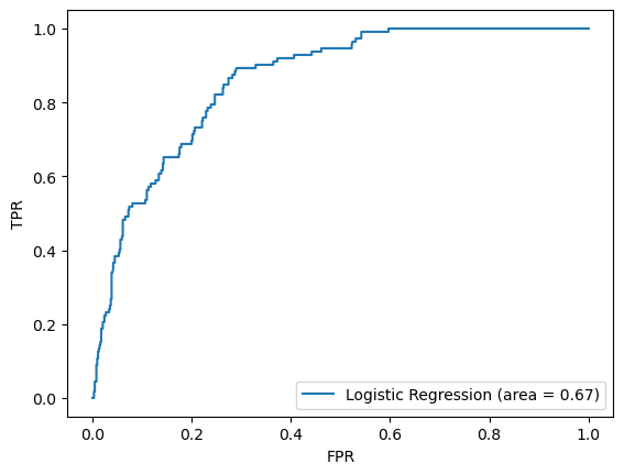
It turns out that the reduced model has practically identical performance with the full model, however, using only 26 features instead of 36.
Feature importance Link to heading
What’s left is to take the final model and plot the importance of the 26 selected features based on their coefficients’ magnitude. To make the interpretation of feature importance even more granular, we can distinguish between positive and negative coefficients.
coefficients = logreg_final.coef_
importance = np.abs(coefficients)
colors = ['royalblue' if i == 1.0 else 'salmon' for i in np.sign(coefficients).flatten()]
feature_importance = pd.DataFrame({'Feature': X_train.iloc[:, rfecv.support_].columns, 'Importance': importance.flatten()})
feature_importance = feature_importance.sort_values('Importance', ascending=True)
feature_importance.iloc[-20:,:].plot(x='Feature', y='Importance', color = colors, kind='barh', figsize=(10, 6))
plt.xlabel("Importance")
plt.legend('',frameon=False)
plt.show()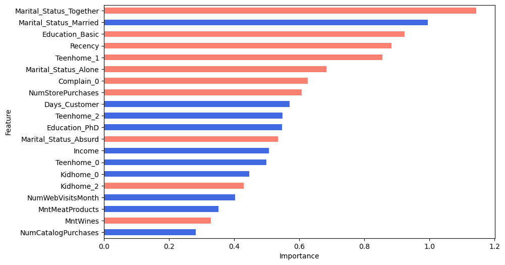
What did we learn from the figure above? First, the categorical features are more important than the quantitative ones as they are higher ranked. Then, the marital status is the most important feature with the likelihood of positive response to the campaign being smallest for the people who are “Together”. Additionally, our feature Days_Customers appears to be fairly influential in determining the success of campaign. More faithful customers are more likely to respond positively. Lastly, note that the negative value of Recency together with the fact that we standardized the quantitative features means that customers that shopped recently will be more likely to respond positively (- * - = +) than those who haven’t shopped in a while.